Building strong local brands? Look at these logos!
Have any of you ever stopped to look at some of our local corporate logos and building designs?Amid recent calls by our government to take 100 local brands abroad, I think they better consult an expert in anthropomorphism before developing their logos.
Here are some classic examples:
1) Ericsson's Cyberjaya buildings and traditional chinese coffins

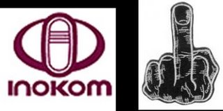
2) Inokom's Corporate Logo and a Middle Finger
 Imagine driving your inokom in town and people see this in the rearview mirror. Someone had better do a market study on whether Inokom vehicles cause more road rage than others!
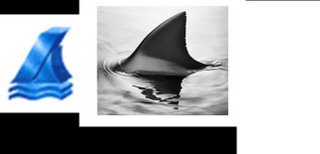
3) Kurnia Insurance logo and a shark's fin.
A terrible choice of logo especially for an insurance company. Sign up with us and be prepared to be eaten alive!


0 Comments:
Post a Comment
<< Home